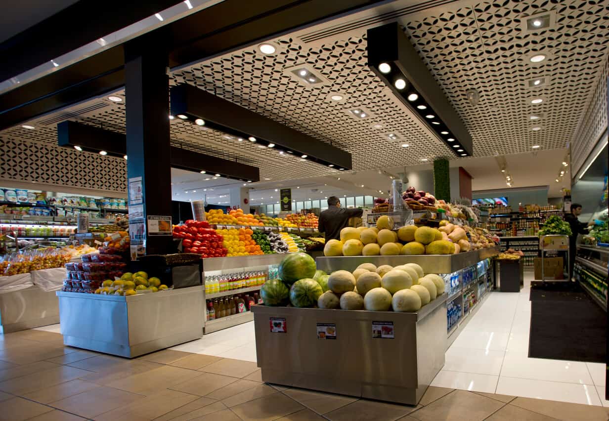
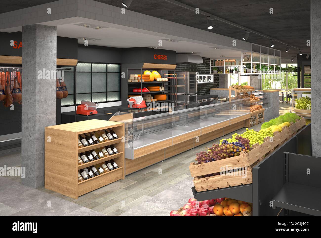
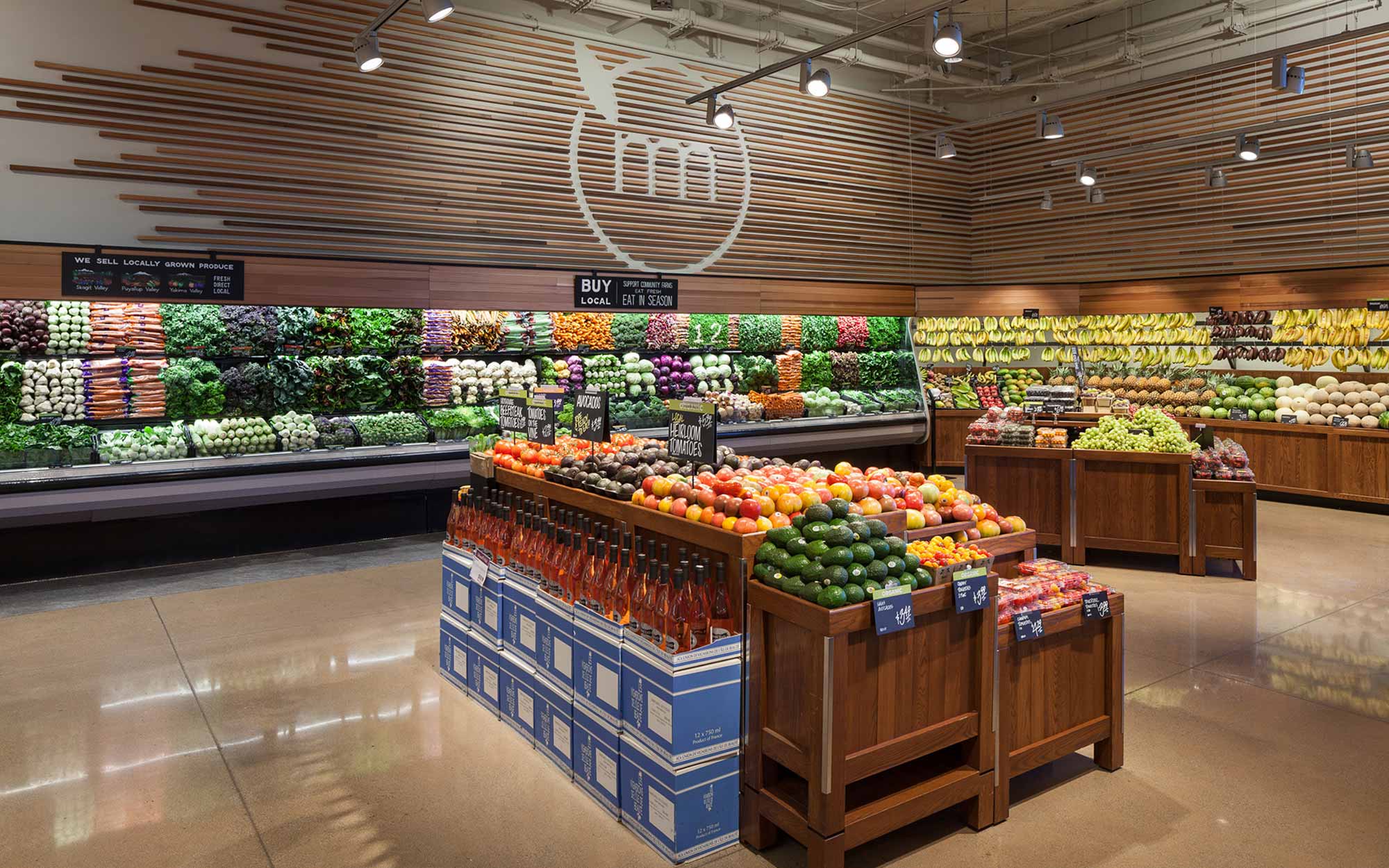
As someone who has spent years in the grocery retail sector, I can attest to the significance of thoughtful grocery store interior design. Not only does it enhance the shopping experience, but it also drives sales and encourages customer loyalty. In this comprehensive guide, we will explore the key components of grocery store interior design, including layout, lighting, branding, and merchandising strategies. Whether you’re a store owner, designer, or just interested in the field, you’ll find valuable insights here.
The Importance of Grocery Store Interior Design
The interior design of a grocery store goes beyond aesthetics. It plays a crucial role in how customers perceive your brand and their overall shopping experience. A well-designed store is not only attractive but functional, promoting efficient navigation and strategic product placement. Here are several key reasons why grocery store interior design matters:
- Enhances Customer Experience
- Increases Sales
- Builds Brand Identity
- Encourages Loyalty
- Optimizes Space Utilization
Key Elements of Grocery Store Interior Design
1. Layout and Flow
The layout of a grocery store is foundational. It determines how easily customers can navigate your space and how products are presented. Let’s explore different types of grocery store layouts:
| Layout Type | Description | Pros | Cons |
|---|---|---|---|
| Grid Layout | Simple, linear layout with parallel aisles. | Maximizes space, easy to navigate. | May feel impersonal. |
| Free-Flow Layout | A less structured layout encouraging exploration. | Creates a relaxed atmosphere, encourages impulse buys. | Can be chaotic, leading to customer frustration. |
| Racetrack Layout | A circular path guiding customers along a loop. | Encourages thorough exploration of the store. | Requires more space. |
| Spine Layout | A central aisle with products branching off. | Easy navigation, allows for clear visibility of all areas. | Can feel cramped if not spaced properly. |

Choosing the Right Layout for Your Store
Selecting the right layout involves understanding your target market and store size. For example, a small community grocery store may benefit from a free-flow layout that encourages customer interaction, while a larger supermarket might opt for a grid layout for efficiency. My experience has shown that observing customer behavior can provide invaluable insights into which layout works best. Consider conducting surveys or focus groups to gather feedback.
2. Lighting Design
Lighting significantly influences the shopping atmosphere. It can highlight products, create ambiance, and even affect mood. Here’s how to leverage lighting effectively:

- Ambient Lighting: Provides overall illumination.
- Task Lighting: Highlights specific areas, like service counters.
- Accent Lighting: Draws attention to features like displays or promotional items.
Lighting Techniques to Consider
In my professional journey, I’ve experimented with various lighting techniques and found the following to be effective:

- Use warm white LED bulbs to create a welcoming environment.
- Incorporate dimmable fixtures to adjust brightness based on time of day.
- Position lights at different heights to create layers of illumination.
- Consider natural light sources, such as windows, to enhance sustainability and reduce energy costs.
3. Color Scheme
The colors you choose can evoke emotions and influence shopping behavior. Research shows that certain colors can lead to specific reactions. Here are some color associations:

| Color | Association |
|---|---|
| Red | Excitement, urgency |
| Blue | Trust, reliability |
| Green | Health, freshness |
| Yellow | Optimism, warmth |
Selecting a Color Scheme for Your Brand
When deciding on a color scheme, think about your brand identity. For example, an organic grocery store may benefit from earthy tones and greens, while a discount grocery store may use bold colors to grab attention. It’s essential to maintain consistency with your branding across all elements, from your store’s interior to your marketing materials.

Merchandising Strategies
Effective merchandising is critical for maximizing sales and enhancing the overall shopping experience. Here are some proven strategies:
1. Product Placement
Strategic product placement can significantly influence buying decisions. Consider the following:

- Eye-Level Placement: Products at eye level tend to sell better.
- Reducing Aisle Width: Wider aisles can create a sense of space, but narrow aisles can lead to more impulse buys as customers are forced to pass by more products.
- Cross-Merchandising: Displaying related products together encourages customers to buy more.
Creating Eye-Catching Displays
Eye-catching displays can draw customers in and encourage purchases. In my experience, using seasonal themes, attractive signage, and unique display structures can significantly enhance the impact of your merchandising. Remember, the goal is to create an inviting space that is pleasing to navigate.

2. Signage and Wayfinding
Clear signage is crucial for helping customers navigate your store. Effective signage can include:
- Directional Signs: Guide customers to different sections.
- Promotional Signs: Highlight sales and special offers.
- Informational Signs: Provide details about products, including prices and nutritional information.
Utilizing Digital Signage
Digital signage is becoming increasingly popular in grocery store design. It allows for dynamic content updates, making it easier to promote flash sales and changes in inventory. Based on my observations, stores that employ digital signage often enjoy higher engagement levels from customers.
Creating a Unique Brand Identity
Your grocery store should reflect your unique brand identity. This extends beyond logos and colors to the overall atmosphere you create. Here are some considerations:
1. Themed Store Designs
Some grocery stores choose to embrace a specific theme that reflects their community or ethos. For instance, a farm-to-table grocery store might opt for rustic decor with wooden displays and green accents. This not only creates an immersive shopping experience but also reinforces the brand message.
2. Customer Engagement Zones
Incorporating areas where customers can engage with products can enhance their experience. Consider adding:
- Tasting Stations: Allow customers to sample products before purchasing.
- Recipe Cards: Provide suggestions on how to use unique ingredients.
- Community Boards: Encourage customer interaction with local events and groups.
Evaluating Your Brand Identity
Branding should be an ongoing process. Regularly seek customer feedback to understand how they perceive your store. Use surveys and comment cards to gather insights and make necessary improvements.
Incorporating Sustainability into Design
Today’s consumers are becoming more conscious of sustainability and eco-friendly practices. Incorporating sustainable design elements can enhance your brand’s image. Here are some strategies to consider:
1. Eco-Friendly Materials
Choose materials that are sustainable, such as reclaimed wood or recycled metals, for fixtures and displays. Not only does this reduce your carbon footprint, but it can also resonate with environmentally conscious consumers.
2. Energy-Efficient Lighting and Appliances
Implementing energy-efficient lighting options, such as LED lights, can significantly reduce energy costs and appeal to eco-conscious shoppers. Investing in energy-efficient refrigeration and HVAC systems can also enhance your store’s sustainability efforts.
Communicating Your Sustainability Efforts
Don’t forget to share your sustainable practices with customers. Use signage to educate shoppers on your eco-friendly initiatives. This transparency can foster goodwill and loyalty among your customer base.
Conclusion
Grocery store interior design is a multifaceted field that requires a careful balance of aesthetics, functionality, and branding. By understanding the key components such as layout, lighting, color, merchandising, and sustainability, you can create an inviting shopping environment that enhances customer experience and drives sales. Throughout my career, I have seen firsthand how impactful a well-designed grocery store can be, not only for customers but for owners and employees as well. Your store’s design isn’t just about selling products; it’s about creating an experience that keeps customers coming back.
FAQs About Grocery Store Interior Design
What is the best layout for a grocery store?
The best layout depends on your store’s size and target audience. Grid layouts work well for larger stores, while free-flow layouts can enhance customer engagement in smaller spaces.
How can lighting impact grocery store sales?
Proper lighting can attract customers to products, create a welcoming atmosphere, and improve overall shopping comfort, which can result in increased sales.
What role does branding play in grocery store design?
Branding influences the overall perception of your store. Consistent branding throughout your design helps customers connect with your business and enhances their shopping experience.
How can I engage customers through store design?
Incorporate interactive elements such as tasting stations, recipe cards, and community boards to encourage engagement and enhance the shopping experience.
What sustainable practices can I implement in grocery store design?
Use eco-friendly materials, install energy-efficient lighting and appliances, and communicate your sustainability efforts through signage to connect with eco-conscious consumers.