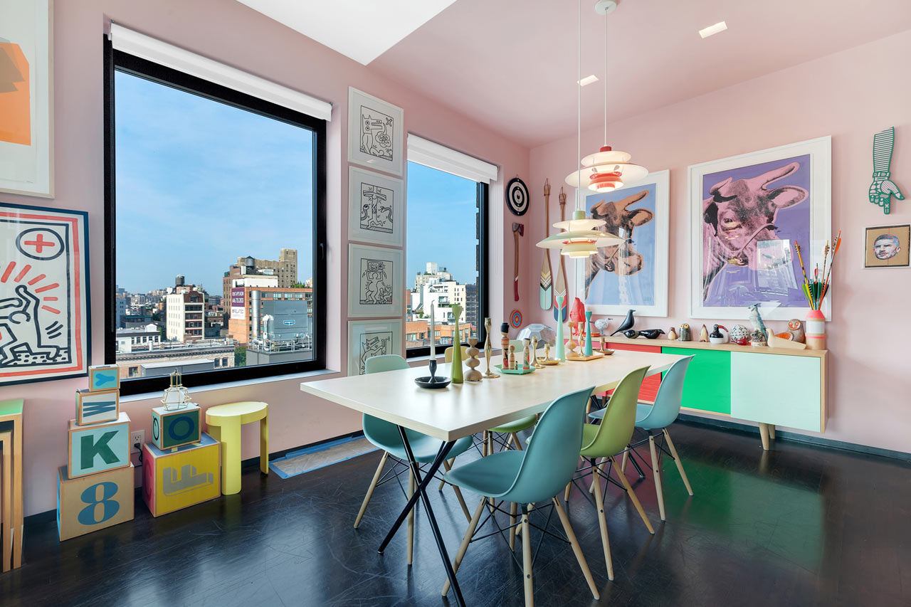
As an interior designer, one of the most exciting parts of my job is experimenting with color. A well-placed pop of color can transform a dull room into a vibrant space. In this comprehensive guide, I’ll share my personal insights, tips, and tricks on how to effectively use color to elevate your designs.
Understanding Color Theory in Interior Design
Before we dive into practical applications, it’s important to understand the basics of color theory.
The Color Wheel and Its Importance
The color wheel is a tool used by artists and designers alike. It helps to visualize how colors relate to one another. Here are the primary categories:
- Primary Colors: Red, Blue, Yellow
- Secondary Colors: Green, Orange, Purple
- Tertiary Colors: Combinations of primary and secondary colors
Complementary Colors
Complementary colors are opposite each other on the color wheel. For instance, blue and orange create a vibrant contrast that can make a space feel dynamic.
Analogous Colors
These colors sit next to each other on the wheel, like green, blue-green, and blue. They provide a harmonious look that is pleasing to the eye.
Why Use a Pop of Color?
Adding a pop of color can invigorate any space. Here are some key reasons why you should consider incorporating this technique:
- Enhances Mood: Different colors can evoke specific emotions.
- Creates Focal Points: A bright color can draw attention to a particular area.
- Personal Touch: It’s an opportunity to express your personality or that of your clients.
How to Effectively Implement a Pop of Color
Now that we understand the importance of color, let’s explore practical ways to implement it into your designs.
1. Choosing Your Color
Start by selecting a color that resonates with the overall theme of the space. Here’s how you can select a color:
| Color | Emotion | Best Use |
|---|---|---|
| Red | Passion, Energy | Accent wall, Artwork |
| Blue | Calm, Serenity | Bedroom, Office |
| Yellow | Happiness, Optimism | Kitchen, Playroom |
| Green | Growth, Nature | Living room, Garden |
2. Choosing the Right Spot for Your Pop of Color
Where you place that splash of color matters. Here are some effective spots:
- Accent Walls: Paint one wall a bold color to create a focal point.
- Furniture: Colorful chairs or sofas can stand out beautifully.
- Accessories: Use pillows, rugs, and artwork to introduce color without overwhelming the space.
3. Balancing Color with Neutrals
One of the best strategies for using color is balancing it with neutrals. This approach allows the vibrant colors to stand out without overwhelming the senses.
Personal Experience: My Journey with Color
Let me share a personal story. A few years ago, I had a client who wanted a calm and serene bedroom. After discussing their preference for blues, we decided to paint one wall a deep navy while keeping the rest light gray. The result was stunning!
The Transformative Power of Color
That room went from ordinary to extraordinary simply by adding that one pop of color. It’s experiences like these that remind me of the powerful influence color has on our environments.
Comparing Color Styles: A Quick Guide
Let’s compare some popular color styles to understand their unique characteristics:
| Color Style | Description | Ideal For |
|---|---|---|
| Monochromatic | Different shades of one color | Minimalist designs |
| Complementary | Using opposite colors for contrast | Modern, dynamic spaces |
| Analogous | Colors next to each other for harmony | Cozy, inviting areas |

Pros and Cons of Using Pops of Color
Pros
- Visual Interest: Colors can add intrigue to your designs.
- Emotionally Invigorating: Bright colors can enhance the mood of a room.
- Easy Refresh: Accessories can easily be switched out for a quick update.
Cons
- Overuse: Too much color can lead to visual chaos.
- Fading: Bright colors may fade over time, requiring maintenance.
- Personal Taste: Colors are subjective; not everyone will love the choices made.
Transforming Spaces: Case Studies
Let’s look at a few case studies that demonstrate successful color implementation.
Case Study 1: The Urban Apartment
This urban apartment was designed with a modern aesthetic. A bold teal accent wall was paired with neutral furnishings, creating a striking yet cohesive look.
Case Study 2: The Family Home
In a family home, we opted for sunny yellows and oranges in the playroom. These colors not only brightened the space but also made it inviting for children.

Frequently Asked Questions (FAQs)
What is the best color to use as a pop in a neutral room?
Bright colors like red, teal, or mustard yellow work exceptionally well in neutral spaces to create a stunning focal point.
How often should I change my pop of color?
It depends on personal taste! Changing accessories seasonally can keep your space feeling fresh without a major overhaul.
Can I mix different pops of color?
Yes! Just ensure that the colors are balanced and complement each other well to avoid overwhelming the space.