Welcome to the world of food store interior design! Whether you’re a seasoned retailer or just starting, understanding the nuances of how your store’s layout and design can enhance customer experience is crucial. With my years of experience in retail and design, I’m excited to share insights and tips to help you create an inviting atmosphere that drives sales.
Understanding the Importance of Food Store Interior Design
The interior design of a food store is not just about aesthetics; it directly influences shopping behavior. A well-planned layout encourages customers to explore, interact, and ultimately purchase more. Let’s delve into why interior design is vital for food stores.
Key Benefits of Effective Interior Design
- Enhanced Customer Experience: A visually appealing store creates a welcoming environment.
- Increased Sales: Strategic layouts can lead to increased impulse buys.
- Brand Identity: Good design reflects your store’s brand and values.
- Efficient Space Utilization: Smart design maximizes product display and customer flow.
- Customer Loyalty: A memorable shopping experience encourages repeat visits.
Essential Elements of Food Store Interior Design
Designing a food store requires attention to several essential elements. Let’s explore these components in detail.
1. Store Layout
The layout determines how products are displayed and how shoppers navigate through your store. Here are some common layouts:
| Layout Type | Description | Pros | Cons |
|---|---|---|---|
| Grid Layout | Straight aisles and rows for easy navigation. | Efficient space use, easy stocking. | Can appear monotonous. |
| Free-Flow Layout | Open, flexible design encouraging exploration. | Enhanced shopping experience, encourages impulse buying. | Can be harder to navigate. |
| Herringbone Layout | Diagonal aisles creating an engaging flow. | Unique aesthetic, encourages movement. | Can confuse some customers. |

2. Color Scheme
Colors evoke emotions and can influence purchasing behavior. Here are some effective color strategies:
- Warm Colors: Red and yellow stimulate appetite.
- Cool Colors: Blue and green evoke calmness and freshness.
- Neutral Colors: Whites and grays create a clean, modern feel.
3. Lighting
Proper lighting highlights products and creates an inviting ambiance. Consider these tips:
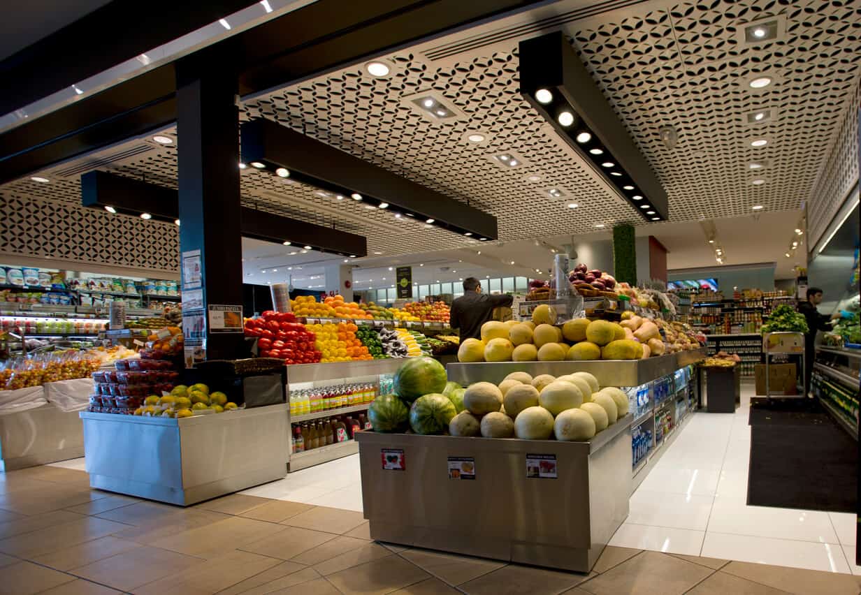
- Use bright lighting in produce sections.
- Incorporate softer lighting near checkout areas to create a relaxed atmosphere.
- Accent lighting can highlight promotional products.

4. Product Placement
Strategic product placement can drive sales. Here’s how to optimize your displays:
- Place high-margin items at eye level.
- Group complementary products together (e.g., pasta and sauce).
- Use end caps for promotions or seasonal items.
Incorporating Technology in Interior Design
Modern food stores incorporate technology to enhance customer experiences. Here are some innovative ideas:

1. Digital Signage
Dynamic displays can showcase promotions and nutritional information, providing value to shoppers.
2. Smart Shelves
These shelves track inventory in real-time, making it easier to manage stock levels and display data.

3. Mobile Apps
Integrate store navigation features into your app to guide customers to products they’re looking for.
Creating a Welcoming Atmosphere
A welcoming atmosphere encourages shoppers to spend more time in your store. Here are some strategies to consider:

1. Music and Aroma
Background music can enhance the shopping experience. Pair it with pleasant aromas (like fresh bread) to create a multi-sensory experience.
2. Open Spaces
Avoid clutter; ample space provides a comfortable shopping experience.

3. Interactive Areas
Include tasting stations or cooking demos to engage customers directly with your products.
Designing for Efficiency: Staff Considerations
The interior design should also accommodate staff needs, enabling them to work efficiently. Here’s what to keep in mind:
1. Back-End Layout
Design stock areas and employee workstations to minimize movement and maximize productivity.
2. Accessibility
Ensure aisles are wide enough for employees to move products without obstruction.
3. Ergonomics
Design for staff comfort with adjustable workstations and proper shelving height.
Real-Life Examples of Successful Food Store Designs
Let’s look at some stores that have effectively utilized interior design principles to create beautiful and efficient shopping spaces.
Case Study: Whole Foods Market
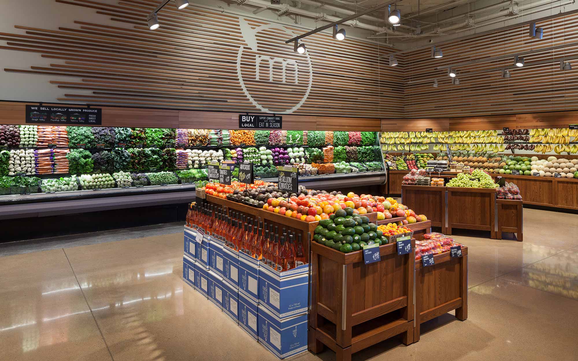
Whole Foods embraces a free-flow layout, allowing customers to roam freely. Their use of natural materials and warm colors reflects their commitment to sustainability and freshness.
Case Study: Trader Joe’s
Trader Joe’s uses a friendly, quirky design with themed décor and handwritten signage that resonates with their approach to personable customer service.
Case Study: Local Artisanal Foods
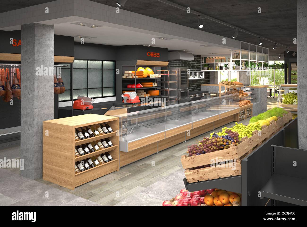
Many local food stores are opting for rustic designs that showcase local craftsmanship, creating a community-oriented vibe that attracts neighborhood shoppers.
Conclusion: The Future of Food Store Interior Design
As consumer preferences evolve, so too must food store designs. The focus on health, sustainability, and technology will shape the future of food retailing. By investing in thoughtful interior design, you can create a shopping environment that not only meets customer needs but also elevates your brand’s identity.
FAQs about Food Store Interior Design
What are the most effective layouts for food stores?
The grid layout is efficient for space management, while free-flow layouts encourage exploration and impulse buying. Choose according to your target customer base.
How can lighting affect a food store’s atmosphere?
Lighting sets the mood of the store; brighter lights in produce sections highlight freshness, while softer lighting can create a more relaxed shopping experience.
What role does branding play in food store design?
Branding through design helps create a cohesive identity, making your store memorable and attracting loyal customers.