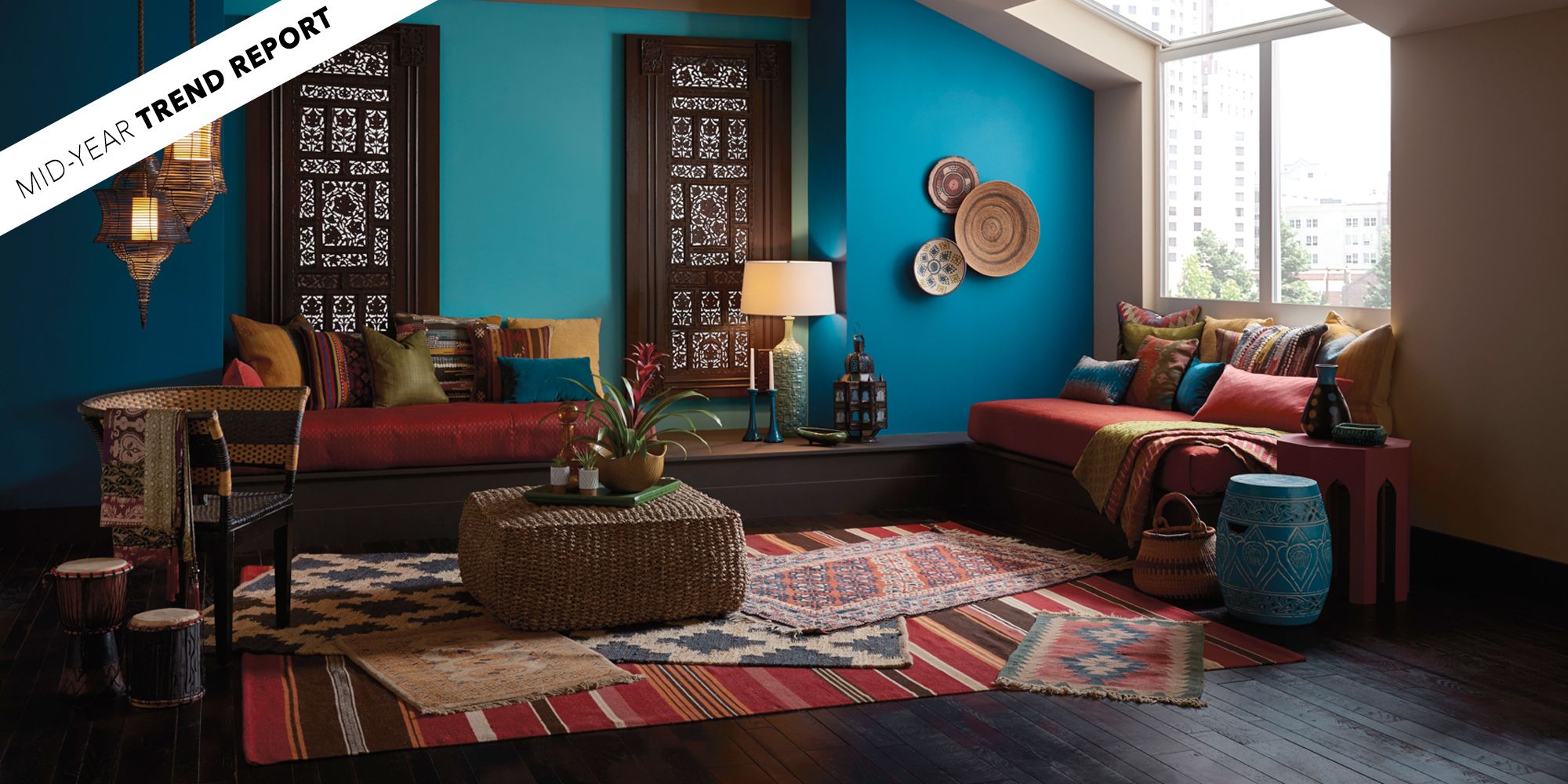
Welcome to the world of color! If you’re exploring ways to breathe new life into your home, you’re in the right place. As an interior design enthusiast with years of experience in transforming spaces, I’m excited to guide you through the stunning paint color trends that graced our walls in 2017. Each color tells a story, and understanding the emotional and aesthetic impact of these hues can transform your space from ordinary to extraordinary.
Understanding the 2017 Color Palette
2017 was a year that embraced boldness and diversity in interior design paint colors. The trends leaned towards both vibrant and subdued hues, creating an intriguing balance. This year’s color forecast was significantly characterized by rich jewel tones, earthy neutrals, and unexpected pastel shades. Let’s dive deeper into the colors that defined the year.
Dominant Color Trends of 2017
Here’s a snapshot of some of the most impactful paint colors that emerged as favorites in 2017:
1. Greenery
Declared as Pantone’s Color of the Year, Greenery symbolized renewal and revitalization. This vibrant hue brought the essence of nature indoors, promoting tranquility and connection to the outdoors.
2. Deep Blue
From navy to cobalt, shades of Deep Blue conveyed sophistication and stability. This color was perfect for creating an inviting atmosphere, particularly in living rooms and bedrooms.
3. Soft Pastels
Pastel colors, especially Soft Pink and Mint Green, provided a refreshing take on home decor, adding a sense of playfulness and serenity.
4. Earthy Neutrals
Colors like Taupe and Greige became favorites for their versatility and warmth, creating cozy environments that felt both timeless and modern.
Choosing the Right Color for Your Space
Selecting the right paint color can be a daunting task. Here’s a guide on how to make an informed decision that reflects your personal style and enhances the ambiance of your rooms.
Factors to Consider
- Natural Light: Observe how much natural light each room receives at different times of the day.
- Room Size: Lighter colors can make small spaces feel larger, while darker hues can create a cozy atmosphere in larger rooms.
- Purpose of the Room: Different rooms serve different functions. For example, calming colors are ideal for bedrooms, while vibrant colors may be better suited for playrooms.
Personal Experience: Choosing a Color
When I painted my home office in Deep Blue, I noticed an immediate shift in my creativity and focus. The color provided a sense of calm while also inspiring productivity. My experience reinforced the importance of choosing a color that resonates with your personal feelings and the activities you engage in.
Color Combinations That Work
Pairing colors can enhance your overall interior design. Here are some expert-recommended combinations that emerged in 2017.

Best Color Pairings
| Color | Complementary Color | Effect |
|---|---|---|
| Greenery | Soft Neutrals | Fresh and Balanced |
| Deep Blue | Gold Accents | Elegant and Luxurious |
| Soft Pink | Charcoal Gray | Chic and Modern |
| Taupe | Dusty Blue | Warm and Inviting |
Pros and Cons of Popular Colors
Every color has its advantages and disadvantages. Here’s a quick overview:

Greenery
- Pros: Refreshing, promotes wellness, versatile.
- Cons: Can be overpowering if used excessively in small spaces.
Deep Blue
- Pros: Elegant, reduces stress, timeless appeal.
- Cons: Might feel dark and heavy in low light.

Soft Pastels
- Pros: Brightens space, playful, great for small rooms.
- Cons: Can appear washed out in dim lighting.
Earthy Neutrals
- Pros: Warm and comforting, matches with various decor styles.
- Cons: May lack excitement without complementary accents.

Painting Tips for a Flawless Finish
Ready to get started on your painting project? Here are some my top tips to ensure your painting endeavors are successful:
Preparation is Key
- Clear the Room: Move furniture and cover floors with drop cloths.
- Clean the Walls: Remove dust and grease to ensure the paint adheres properly.
- Choose Quality Supplies: Invest in high-quality brushes, rollers, and paint for the best results.

Applying the Paint
When painting your walls, start by cutting in around the edges with a brush before using a roller for large areas. Always apply two coats for a richer, more professional finish.
Finishing Touches
Once you’ve painted, be sure to remove tape carefully and allow your walls to cure fully before hanging any art or decorations. Take a moment to step back and admire your handiwork!

FAQs about Interior Design Paint Colors of 2017
What was the Pantone Color of the Year for 2017?
The Pantone Color of the Year for 2017 was Greenery, symbolizing renewal and fresh beginnings.
How do I choose the right paint color?
Consider the lighting, size, and purpose of each room. Testing paint samples on your walls can also help visualize how colors will look in your space.
What are the best combinations for pastel colors?
Soft pastels like pink can be beautifully paired with deeper colors like charcoal gray for a modern look. Mixing warm and cool tones can also create balance.
Are earthy neutrals still in style?
Yes, earthy neutrals remain timeless and versatile, seamlessly fitting into various design styles from traditional to contemporary.
Conclusion: Embrace the Colors of 2017
Your choice of paint colors can have a profound impact on your living space and mood. The trends of 2017 invite you to explore a palette that resonates with you, whether that’s the tranquility of Greenery or the sophistication of Deep Blue. By understanding the power of color, you can create a home that reflects your personality and enhances your lifestyle.
Now, armed with knowledge and inspiration, it’s time to roll up your sleeves and get painting! Transform your home into a beautiful reflection of you with the captivating interior design paint colors that defined 2017.