Welcome! As a decorator, showcasing your unique style and services is crucial. One effective way to do this is through beautifully designed advertising cards. In this article, we will explore various examples of advertising cards for decorators, including design ideas, pros and cons, and personal experiences to inspire your marketing strategy!
Understanding the Importance of Advertising Cards in Decoration
Advertising cards, or business cards, are more than just contact information; they are a tangible representation of your brand. They help you make a lasting impression. With the right design, you can communicate your style, professionalism, and creativity instantly.
Key Elements of Effective Advertising Cards
1. Design and Aesthetics
Your card’s design should reflect your decorating style. Use colors, fonts, and images that resonate with your work. For instance, if you specialize in minimalist designs, a clean and simple card would be ideal.
2. Contact Information
Ensure that your contact details are clear and easy to read. Include your phone number, email, and website. Social media handles can also be beneficial, especially if you showcase your work online.
3. Unique Selling Proposition (USP)
What sets you apart from other decorators? Mention your USP on your card to give potential clients a reason to choose you. This could be anything from eco-friendly materials to specialized styles.
4. Call to Action (CTA)
A simple line that encourages action can increase engagement. Phrases like “Call for a consultation!” or “Visit our website for more ideas!” can be effective.

Examples of Advertising Cards for Decorators
1. Minimalist Design
Minimalist cards focus on clean lines and limited colors. Here’s an example:
- White background with black text
- Logo prominently displayed
- Contact information neatly spaced
2. Bold and Colorful
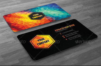
If your style is vibrant and eclectic, a bold card can make a statement:
- Bright colors that match your portfolio
- Artistic graphics or patterns
- Creative layout with overlapping elements

3. Textured Cards
Textured cards can provide a tactile experience:
- Use of embossed patterns
- Foil stamping to highlight key details
- Thick cardstock for a premium feel
Comparison Table of Card Styles
| Card Type | Pros | Cons |
|---|---|---|
| Minimalist | Timeless, Versatile | May seem too plain |
| Bold and Colorful | Eye-catching, Unique | Can be overwhelming |
| Textured | Luxurious feel | Higher production cost |

Tips for Designing Your Advertising Card
1. Use Professional Design Software
Tools like Adobe Illustrator or Canva can help you create stunning designs. They offer templates and customizable options tailored for decorators.
2. Seek Feedback
Before finalizing your design, get feedback from peers or even potential clients. Their insights can help refine your card for better appeal.

3. Keep It Consistent
Your card should align with your overall branding, including your website and social media presence. Consistency builds trust.
Personal Experiences with Advertising Cards
In my journey as a decorator, I’ve learned that a well-designed advertising card not only showcases your work but also often leads to referrals. I once handed out cards at a local craft fair, and within a week, I received three inquiries that turned into projects. The key was the captivating design that sparked conversation.

FAQs About Advertising Cards for Decorators
What size is best for advertising cards?
The standard size is 3.5″ x 2″. It’s a convenient size that fits in wallets and cardholders.
Can I design my cards myself?
Absolutely! With numerous design tools available, creating your card has never been easier, even without professional design experience.
How many cards should I print?
Starting with 500-1000 cards is usually a good idea, but assess your networking opportunities and adjust accordingly.
Should I include a QR code on my card?
Yes, a QR code can link to your portfolio or website, making it easy for potential clients to learn more about your work.