As a passionate interior designer and enthusiast, I’ve always been captivated by how colors can transform a space. One of the most fascinating techniques I’ve come across is the split complementary color scheme. This approach not only adds depth and dynamism to a room but also creates a balanced and inviting atmosphere. In this article, I will share everything you need to know about split complementary color schemes, from the basics to practical tips, and even my personal experiences with this vibrant design method.
What is a Split Complementary Color Scheme?
A split complementary color scheme is a variation of the traditional complementary color scheme. In complementary color schemes, two colors that are opposite on the color wheel are used together. However, in a split complementary scheme, you take one base color and use the two colors adjacent to its complementary color. This results in a more vibrant palette that maintains harmony while allowing for a burst of color.
Understanding the Color Wheel
Before diving deeper into split complementary color schemes, it’s essential to understand the basics of the color wheel. The color wheel is divided into primary, secondary, and tertiary colors:
- Primary Colors: Red, Blue, Yellow
- Secondary Colors: Green, Orange, Purple
- Tertiary Colors: Colors created by mixing primary and secondary colors, such as Red-Orange or Yellow-Green.
Benefits of Using a Split Complementary Color Scheme
Employing a split complementary color scheme in your interior design has several benefits:
1. Visual Interest
This scheme allows for a vibrant mix of colors that enhances visual interest. It can make spaces feel more dynamic and engaging.
2. Balance and Harmony
Despite the use of contrasting colors, a split complementary scheme maintains a sense of balance. Since one color is dominant and the others provide accents, the overall look remains harmonious.

3. Versatility
This color approach is versatile and can work in various design styles from modern to traditional, making it suitable for virtually any space.
How to Create a Split Complementary Color Scheme
Creating an effective split complementary color scheme involves a few thoughtful steps:

Step 1: Choose Your Base Color
Start by selecting a dominant color that reflects the mood you want to create in the space. Consider the function of the room: a calming blue for a bedroom or a lively yellow for a kitchen.
Step 2: Locate the Complementary Color
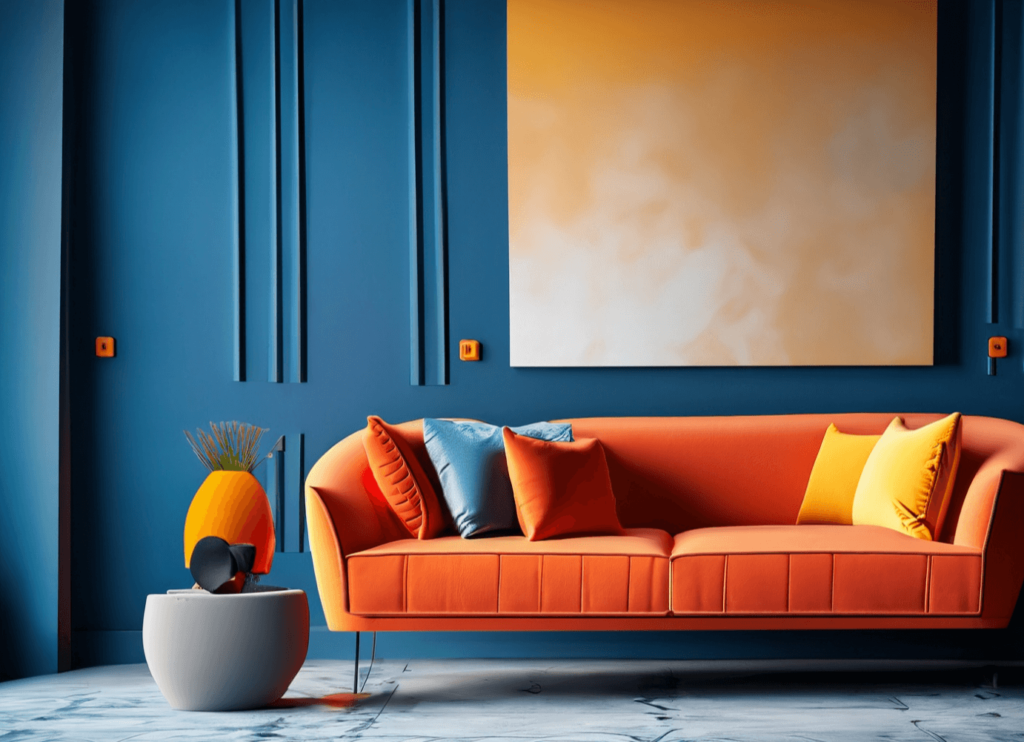
Once you have your base color, find its complementary color on the color wheel. For example, if you choose blue, the complementary color is orange.

Step 3: Identify the Split Colors
Next, look at the colors adjacent to the complementary color. For blue, the split colors would be yellow-orange and red-orange. These colors will be your accents.
Step 4: Apply the Colors in Your Design
Integrate your base color into larger elements such as walls or furniture, while using the split colors in smaller doses through accessories, art, or textiles.

Practical Tips for Implementing Split Complementary Schemes
Here are some practical tips I’ve gathered over the years for effectively using split complementary color schemes:
1. Stick to a Dominant Color
Make sure one color is dominant to prevent the space from feeling chaotic. The goal is to create a sense of flow.

2. Use Neutrals Wisely
Incorporate neutral tones (like grays, whites, and beiges) to help balance the vibrancy of your split complementary palette.
3. Test with Samples
Before committing to a color, test paint samples in the space. Observe how they look at different times of the day.
4. Consider Lighting
Lighting can dramatically affect how colors appear. Always consider natural and artificial light when choosing your palette.
5. Focus on Textures
Incorporate various textures to add depth. This can be achieved through textiles like pillows, rugs, and curtains.
Examples of Split Complementary Color Schemes
To give you a clearer idea, here are a few examples of effective split complementary color schemes:
| Base Color | Complementary Color | Split Colors | Usage Example |
|---|---|---|---|
| Blue | Orange | Yellow-Orange, Red-Orange | Blue walls with orange accents in decor and upholstery. |
| Red | Green | Yellow-Green, Blue-Green | Red furniture complemented by blue-green throw pillows. |
| Yellow | Purple | Red-Purple, Blue-Purple | Yellow walls with blue-purple art pieces and decor. |
Split Complementary vs. Traditional Complementary Color Schemes
It’s also helpful to understand how split complementary schemes differ from traditional complementary schemes. Here’s a quick comparison:
| Aspect | Split Complementary | Traditional Complementary |
|---|---|---|
| Color Balance | More balanced with less tension | High contrast, can feel jarring |
| Visual Interest | Increased depth and dynamism | Potentially flat without careful implementation |
| Usage | Versatile across various styles | Best for bold, modern designs |
Pros and Cons of Split Complementary Color Schemes
Pros
- Creates vibrant and dynamic spaces
- Maintains a sense of balance
- Allows for creativity without overwhelming the senses
Cons
- Can be challenging to execute effectively without prior knowledge
- If overdone, it can lead to visual chaos
- Requires careful consideration of lighting and textures
My Personal Experience with Split Complementary Color Schemes
Let me share a quick story. A few months ago, I was tasked with redesigning a friend’s living room. They wanted something fresh and inviting but also cozy. I proposed a split complementary scheme using a soft teal as the base color. The complementary color was coral, with yellow-orange as an accent. The result was stunning! The room felt simultaneously vibrant and welcoming, proving that this technique works wonders when done right.
FAQs about Split Complementary Color Schemes
1. What is the difference between complementary and split complementary colors?
Complementary colors are direct opposites on the color wheel, while split complementary colors involve a base color and the two adjacent colors to its complementary color.
2. Can split complementary color schemes be used in small spaces?
Absolutely! Using a split complementary scheme can add depth to small spaces, but it’s essential to balance vibrant colors with neutrals to avoid overwhelming the area.
3. How do I choose the right colors for my split complementary scheme?
Start by selecting a base color that reflects your desired mood. Then, find its complementary color and choose the two adjacent colors on the wheel. Testing samples in your space is crucial before making final decisions.
4. What are some common mistakes to avoid with split complementary color schemes?
Common mistakes include using too many vibrant colors without a dominant hue, neglecting to incorporate neutrals, and ignoring the effects of lighting on color perception.
Conclusion
Incorporating a split complementary color scheme in your interior design can breathe new life into your spaces. Whether you’re a seasoned designer or a DIY enthusiast, understanding this approach can enhance your color palette significantly. Remember to experiment with your choices and trust your instinct. After all, your home should be a reflection of you.
I hope you found this guide on split complementary color schemes informative and inspiring. Have fun experimenting with colors and creating beautiful, inviting spaces!