Interior design is an art form that combines color, space, and functionality to create beautiful living environments. One of the most effective techniques to achieve this balance is through the use of color theory, particularly the split complementary color scheme. In this article, we’ll explore the concept of split complementary color design, its advantages, and how to implement it in your own home. By the end, you will have the tools and knowledge to transform your space into a harmonious and visually appealing haven.
What is Split Complementary Interior Design?
Split complementary interior design involves a color scheme based on a single base color and the two colors adjacent to its complementary color on the color wheel. This method creates a vibrant yet balanced look that enhances the aesthetic appeal of any room.
The Color Wheel Explained
To understand split complementary colors, one must first grasp the color wheel. The color wheel is a circular diagram representing the relationship between different hues. It includes:
- Primary Colors: Red, Blue, Yellow
- Secondary Colors: Green, Orange, Purple (created by mixing primary colors)
- Tertiary Colors: Combinations of primary and secondary colors (e.g., Red-Orange)
Visualizing Split Complementary Color Schemes
Imagine a triangle formed on the color wheel: select one base color and draw a line to its direct complementary color. The two colors on either side of the complementary color are your split complementary hues.
The Psychology of Color in Interior Design
Colors evoke emotions and set the mood. Understanding the psychology behind color choices can help you create spaces that resonate well with your lifestyle.
Effects of Primary Colors
| Color | Emotion | Best Rooms |
|---|---|---|
| Red | Energy, Passion | Living Room, Dining Room |
| Blue | Calmness, Trust | Bedroom, Office |
| Yellow | Happiness, Warmth | Kitchen, Playroom |
Benefits of Using Split Complementary Colors
- Dynamic Visual Interest: A split complementary scheme can add depth and excitement to your space without overwhelming it.
- Balance: The scheme ensures that no single color dominates, creating a harmonious environment.
- Versatility: Works well in various design styles, from modern to traditional.

How to Implement Split Complementary Interior Design
Implementing a split complementary color scheme involves several steps. Here’s how to do it effectively:
Step 1: Choosing Your Base Color
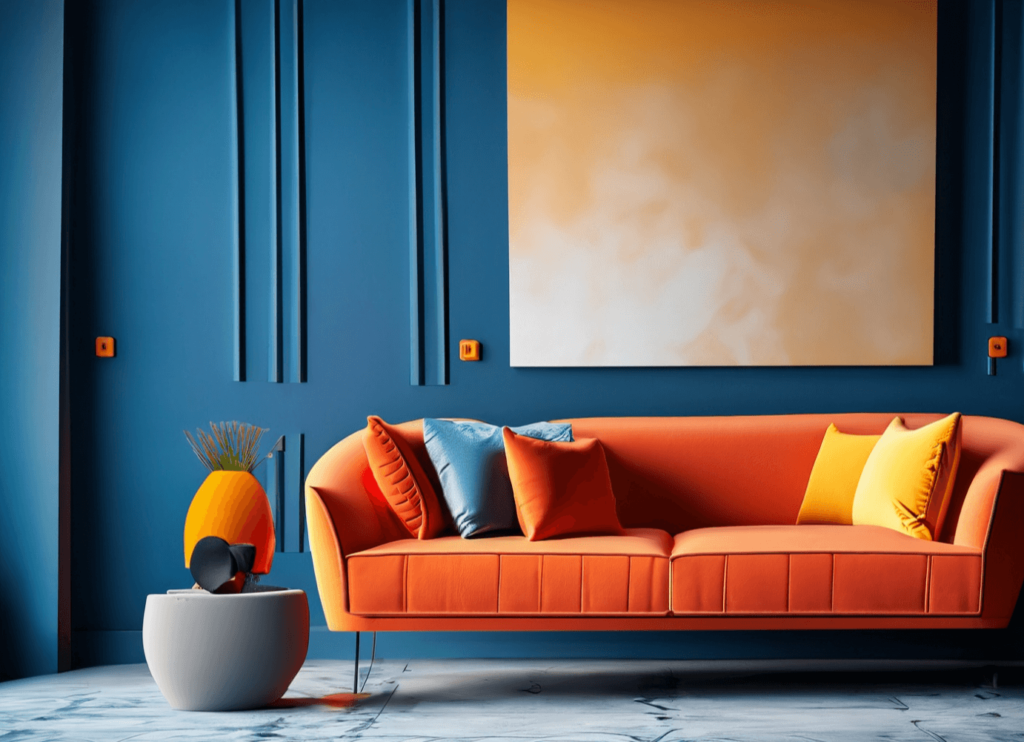
Consider what mood you want to evoke in the room. For example, if you desire energy and warmth, you might choose a vibrant orange.

Step 2: Identify Complementary Colors
Once you have your base color, find its complementary color on the color wheel. Continuing with orange, the complementary color is blue. The split complementary colors would therefore be the two colors adjacent to blue: teal and navy.
Step 3: Use the Colors Strategically
When applying these colors, it’s crucial to allocate your base color to the largest areas (like walls or large furniture) and use the complementary colors as accents (cushions, artwork, rugs).

Step 4: Consider Textures and Materials
Incorporating different textures can enhance the visual appeal. Think about using matte finishes, glossy surfaces, or natural materials like wood to build depth.
Step 5: Lighting Matters
Lighting can drastically change how colors appear. Natural light, soft ambient lighting, and spotlights can showcase your color choices in the best way possible.

Practical Examples of Split Complementary Color Schemes
Living Room Example
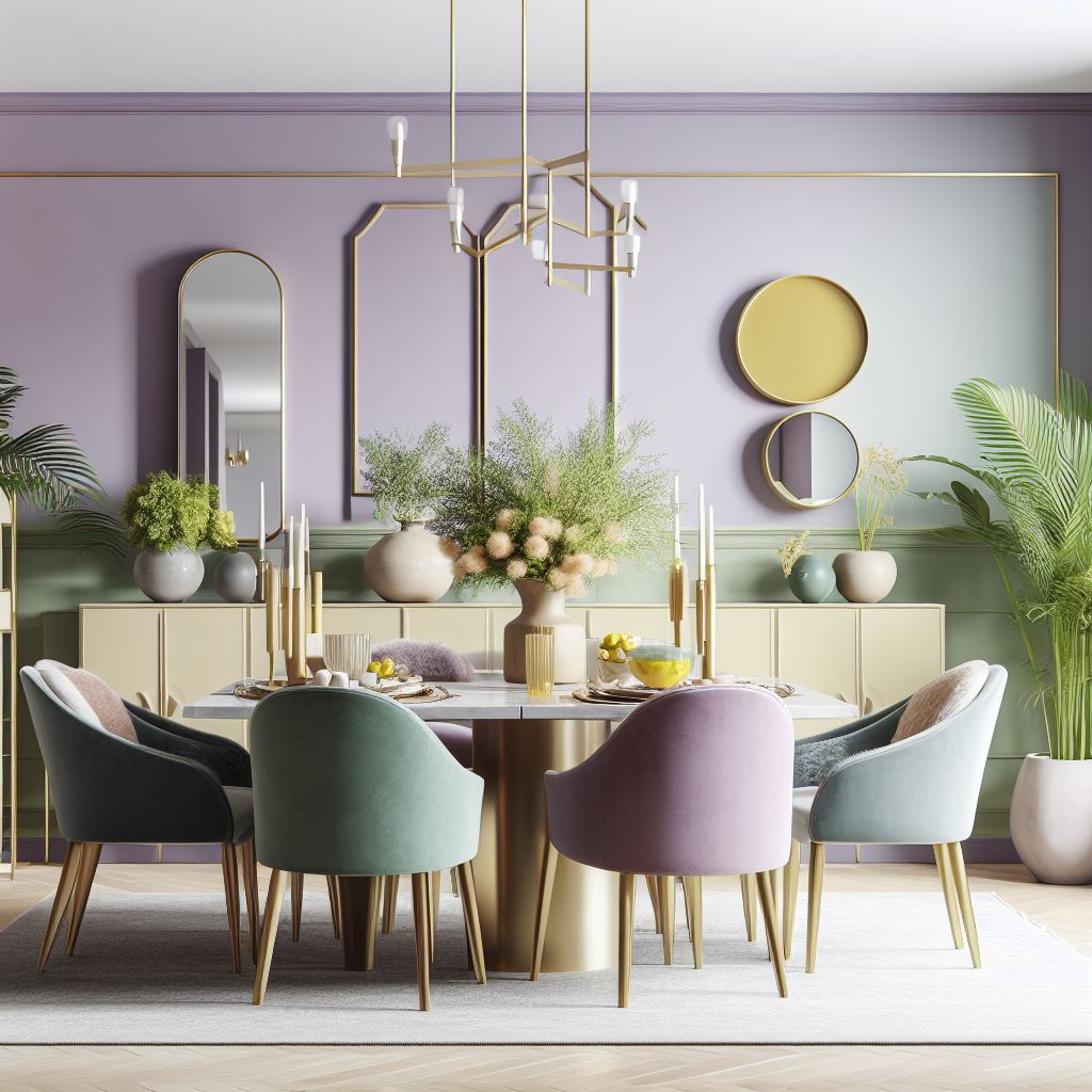
Let’s say you choose a soft, muted green as your base color. Its complementary color is red, making the split complementary colors a warm coral and a deep pink. Consider the following layout:
| Color Usage | Application |
|---|---|
| Muted Green | Walls and a sectional sofa |
| Coral | Cushions, a rug, and a few decorative items |
| Deep Pink | Artwork and curtains |
Bedroom Example
For a serene bedroom, choose a calming blue as your base color. Its complementary color is orange, with the adjacent colors being peach and golden-yellow:
| Color Usage | Application |
|---|---|
| Calming Blue | Walls and bedding |
| Peach | Curtains and throw pillows |
| Golden Yellow | Accent chair and lampshade |
Common Mistakes to Avoid in Split Complementary Design
Even seasoned designers can make mistakes. Here are common pitfalls to be wary of:
- Too Many Shades: Stick to your split complementary colors; adding too many can lead to chaos.
- Neglecting Balance: Ensure that the distribution of colors is balanced. Too much of one color can throw off harmony.
- Ignoring Lighting: Natural and artificial lighting can alter the appearance of colors. Test your choices in different lighting conditions.
Pros and Cons of Using Split Complementary Colors in Interior Design
| Pros | Cons |
|---|---|
| Creates dynamic, eye-catching designs | Can be challenging to balance colors effectively |
| Allows for vibrant accents without overwhelming | Requires a good understanding of color theory |
| Versatile for any interior style | Can look dated if trends change |
Incorporating Patterns and Textures
Patterns and textures play a crucial role in split complementary designs. Here are some ideas:
- Textured Fabrics: Use a mix of fabrics like velvet and linen in your accent colors for added depth.
- Patterned Rugs: Consider geometric patterns that incorporate your color scheme.
- Artwork: Choose wall art that either uses your color scheme or complements it.
Frequently Asked Questions (FAQs)
What is the difference between complementary and split complementary color schemes?
Complementary color schemes involve one color and its direct opposite on the color wheel, while split complementary includes a base color and the two adjacent colors to its complementary counterpart.
How do I choose my base color for split complementary design?
Consider the mood and feel you want to create in the room. Test swatches in the space to see how they interact with light and other elements.
Can I use split complementary colors in any room?
Absolutely! This technique is versatile and can be applied to any room in your home, from kitchens to bedrooms.
Are there any specific styles that work well with split complementary colors?
Split complementary colors can complement various styles, including modern, bohemian, farmhouse, and traditional. It’s all about how you apply the colors and elements.
Conclusion
Mastering split complementary interior design can transform your living spaces into visually exciting and harmonious environments. As you embark on your design journey, remember that the key is balance and personal expression. So whether you’re revamping a single room or your entire home, embrace this color scheme and watch as your spaces come to life!