When you step into a Nike store, you’re not just entering a retail space; you’re stepping into a meticulously curated environment that reflects the brand’s ethos and commitment to innovation. In this article, we’ll explore the various elements of Nike store interior design, including layout, color schemes, and customer engagement strategies. We’ll also share personal experiences and insights that will help you appreciate the art behind retail design.
Understanding Nike’s Brand Identity
Nike is not just a brand; it’s a lifestyle. Its core philosophy revolves around inspiration and innovation, which is reflected in every aspect of its store design. The aim is to create a space that resonates with its customers while standing out in the competitive retail environment.
The Importance of Store Layout
One of the most significant aspects of interior design is the layout. A well-thought-out layout guides customers through the store and encourages them to explore products.
Open vs. Zone Layout
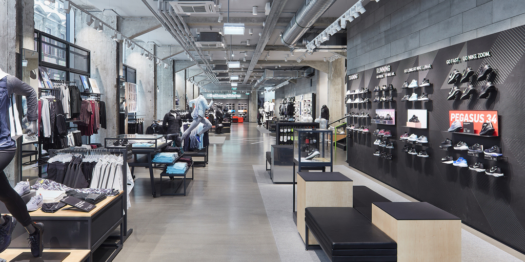
Nike stores typically use a combination of open and zone layouts. Here’s a quick comparison:
| Layout Type | Description | Pros | Cons |
|---|---|---|---|
| Open Layout | Features wide spaces with minimal barriers | Encourages exploration, fosters a social atmosphere | Lack of privacy, can become chaotic |
| Zone Layout | Divides the store into distinct sections | Enhances product visibility, improves navigation | Can feel cramped, less versatile |
Key Elements of Nike Store Interior Design
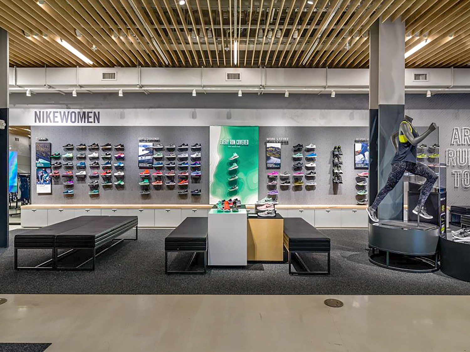
Several key design elements contribute to the overall aesthetic and functionality of Nike stores. Understanding these elements helps to appreciate the thought process behind each store layout.
Color Schemes and Branding
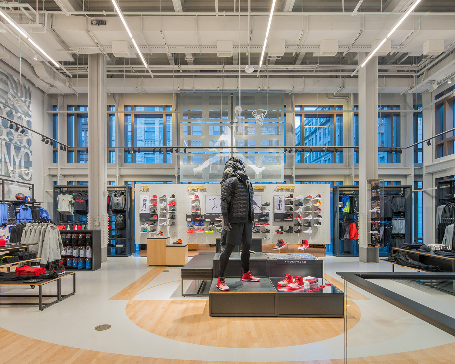
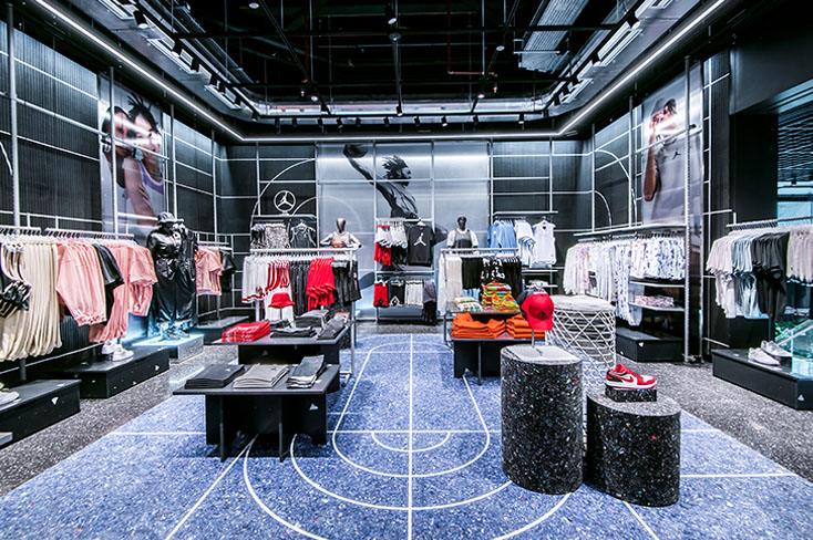
Color plays a critical role in establishing a brand’s identity. Nike’s use of black, white, and vibrant colors reflects its bold nature. Each color is selected to evoke specific emotions:
- Black: Power and sophistication.
- White: Simplicity and freshness.
- Vibrant Colors: Energy and excitement.
Lighting Design
Effective lighting enhances product visibility and creates an inviting atmosphere. Nike stores often use a combination of:
- Ambient Lighting: General illumination.
- Accent Lighting: Highlights specific products.
- Task Lighting: Provides focused light for activities.
Material Selection
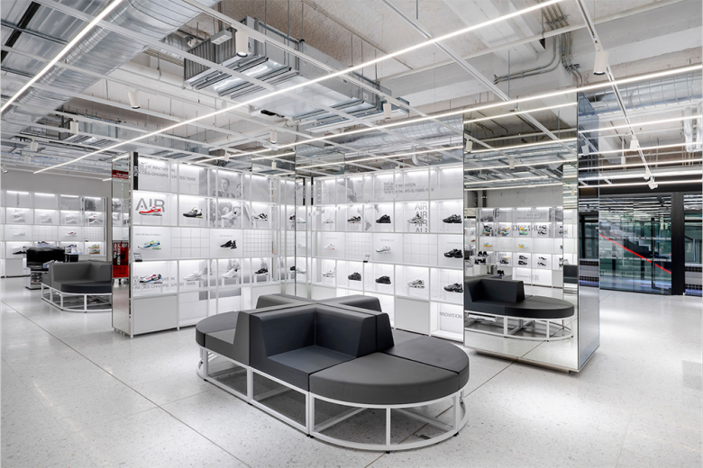
The choice of materials in Nike stores not only aligns with the brand’s sustainability efforts but also enhances the overall aesthetic. Common materials include:
- Recycled Materials: Promotes sustainability.
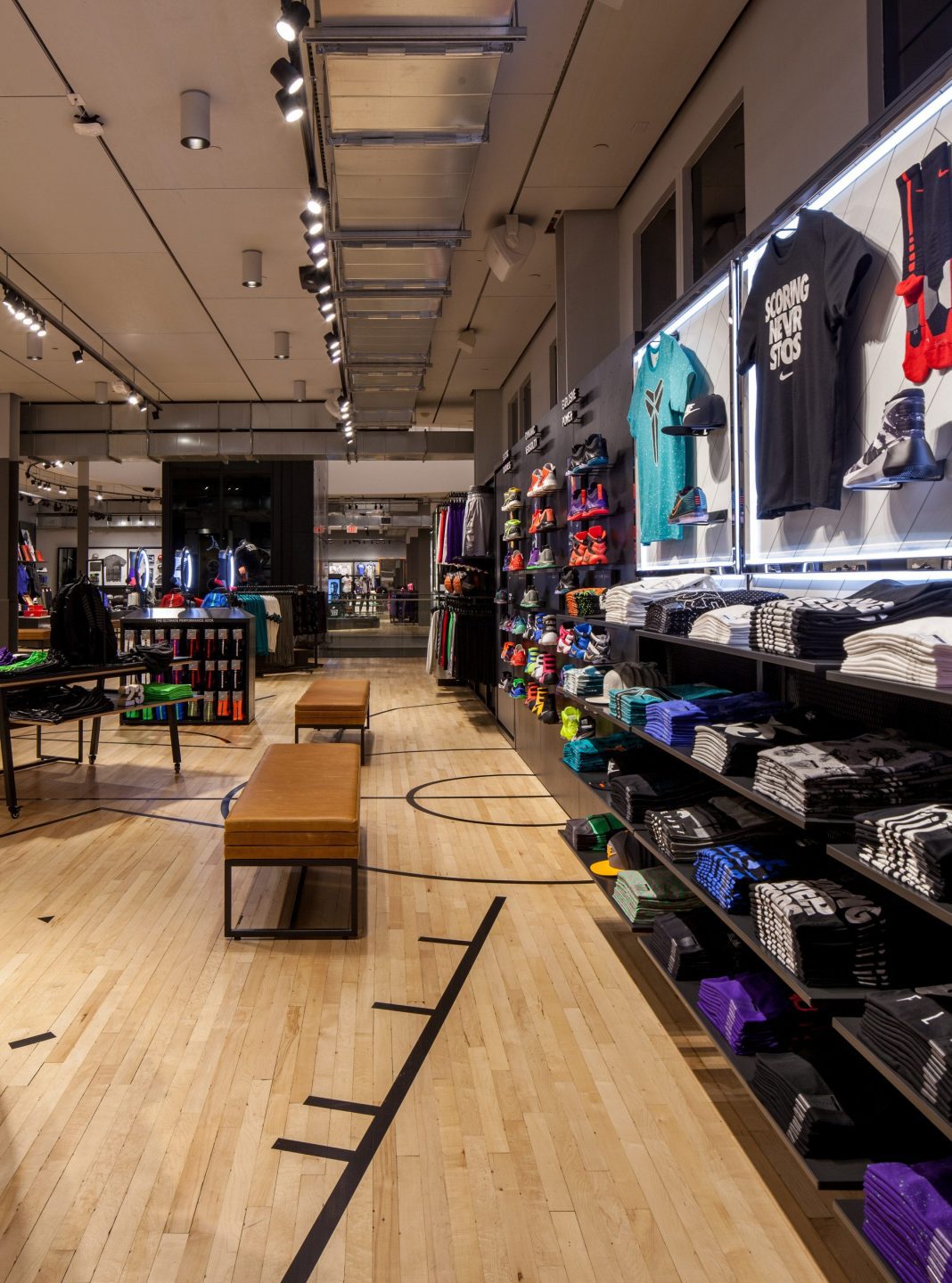
- Natural Wood: Adds warmth and texture.
- Metal Accents: Offers a modern, industrial feel.
Creating an Immersive Customer Experience
Nike’s store design goes beyond merely selling products; it aims to create an experience that engages customers on multiple levels. Here are a few strategies employed:
Interactive Displays
Many Nike stores feature interactive displays that allow customers to engage with products physically. This could include smart mirrors that show product details or virtual try-on experiences.
Community Spaces
Some Nike stores incorporate community spaces for events, workshops, or fitness classes. This not only promotes the brand but also fosters a sense of community among customers.
Case Study: Nike’s House of Innovation
Nike’s flagship store, often referred to as the House of Innovation, is a prime example of how the brand successfully integrates these elements. With its state-of-the-art technology and immersive environments, the store offers an unparalleled shopping experience.

Personal Insights: My Experience in a Nike Store
Walking into a Nike store feels like entering a hub of energy. The first thing that caught my attention was the vibrant colors and the layout that encouraged movement. I found myself wandering through different zones, each showcasing products tailored to specific activities—from running to basketball. The interactive displays allowed me to engage with products in a way that felt personalized and unique.
Pros and Cons of Nike Store Interior Design
| Pros | Cons |
|---|---|
| Immersive customer experience | Can be overwhelming for first-time visitors |
| Strong brand identity | High maintenance costs for elaborate designs |
| Effective use of space | May not cater to all demographics equally |
Future Trends in Retail Design: What’s Next for Nike?
As retail evolves, so too will Nike’s approach to store design. Here are some anticipated trends:
Integration of Technology
With the rise of augmented reality (AR) and virtual reality (VR), we can expect Nike stores to offer even more interactive experiences. Customers might engage with products through immersive technology that enhances their shopping experience.
Sustainability Focus
As sustainability becomes increasingly important, Nike is likely to continue investing in eco-friendly materials and practices, making their stores not just stylish but also responsible.
Conclusion: The Power of Design in Retail
The interior design of Nike stores is a masterclass in retail strategy. Each element, from layout to material choice, is carefully considered to create an environment that resonates with customers and reinforces the brand’s identity. Whether you’re a seasoned shopper or a curious onlooker, the Nike store experience is one that leaves a lasting impression.
Frequently Asked Questions (FAQs)
What are the key elements of Nike store interior design?
Key elements include layout, color schemes, lighting design, and material selection that reflect Nike’s brand identity.
How does Nike enhance customer engagement in their stores?
Nike enhances customer engagement through interactive displays, community spaces, and immersive experiences.
What is the significance of sustainability in Nike store design?
Sustainability is significant as it aligns with modern consumer values and Nike’s commitment to environmental responsibility.
How does technology influence Nike’s store experiences?
Technology influences store experiences through interactive displays, smart mirrors, and potential uses of AR and VR in the future.
Can Nike’s store design be replicated in other retail environments?
Yes, elements of Nike’s store design can be adapted to enhance the customer experience in various retail settings, focusing on layout and engagement.